Radio
What is a Radio input control?
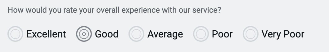
A radio control allows the user of the Adaptive Document to select an input from a defined set of options.
For example: Imagine you are creating a feedback form. The users can register their objective opinion and can rate the service from Excellent to Very Poor.
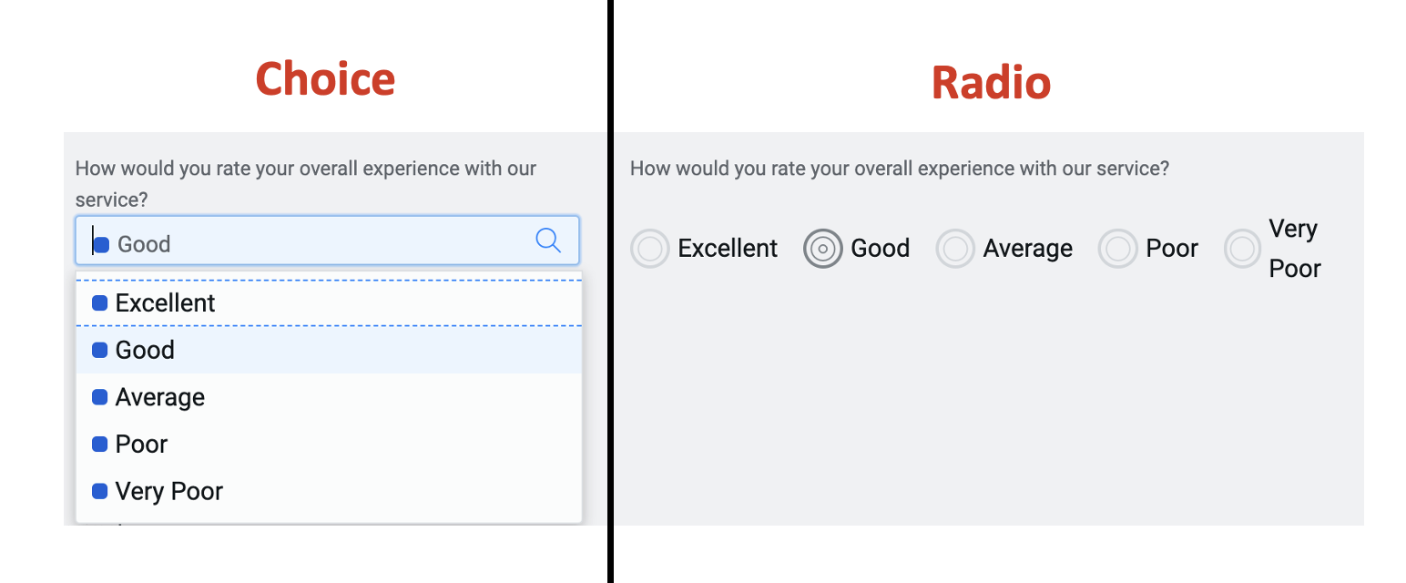
The radio control is very similar to the Choice control.
You may consider using the radio control over choice control when:
- There are fewer options and are mutually exclusive in nature.
- When visibility of all options at a glance is required for quick comparison by the user.
- You have enough space to show all options and arrangement does not clutter experience.
How does the Element Configuration Panel for Radio control appear?
The Element configuration panel for the radio control appears as shown in the below image:
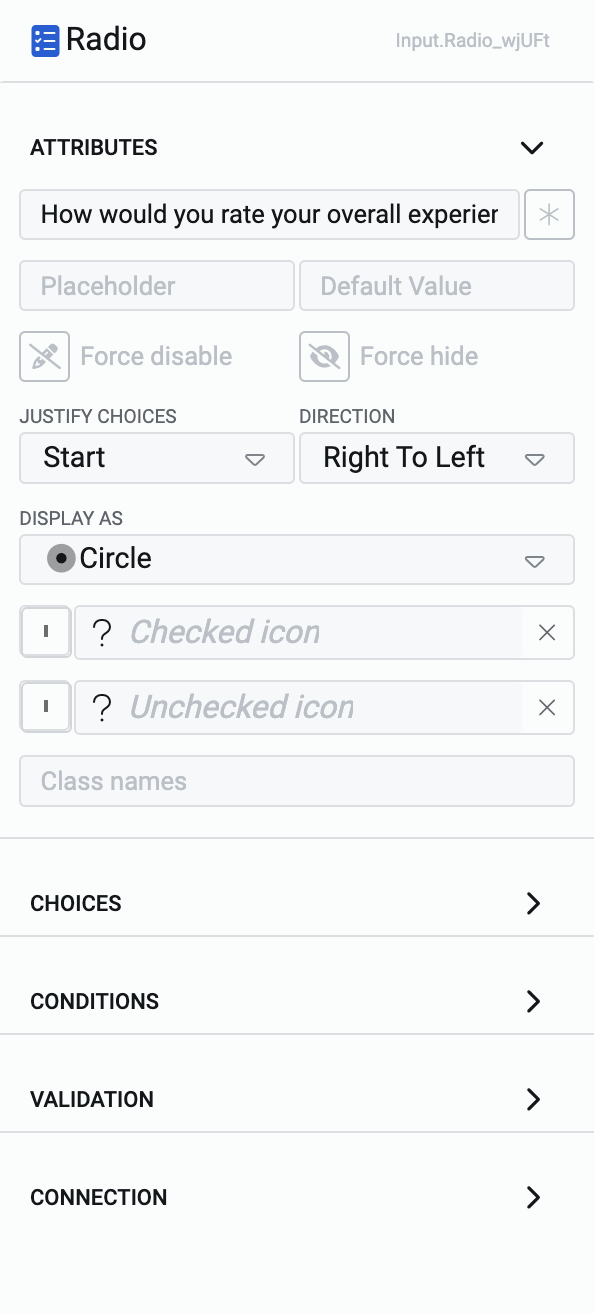
The panel has five categories:
- Attributes - To define the appearance of the Radio element.
- Choices - To define the options that appear in the Radio element.
- Conditions - To define the conditions when the Radio element be enabled/disabled and/or shown/hidden.
- Validation - To define the validation rule for the Radio element.
- Connection - To establish connection of the Radio element with a table column.
In this article, we shall discuss about Attributes and Choices configuration categories only.
Attributes category
Consider the following image and corresponding list sequentially explaining the fields of the attributes section for Radio control.
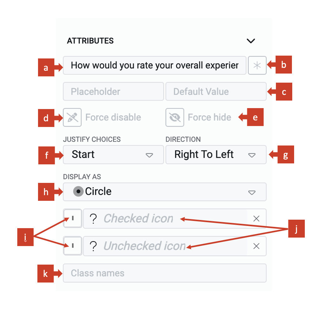
a. Label - This field allows you to type the label to the Radio control. The label shall appear above the element in the Adaptive Document and is used to provide context for the user.
b. Asterisk (*) sign - If you click ON this field, then an asterisk sign will appear next to the label. This is used to indicate a special message to the users of the document. For example - conditions apply, the element is mandatory etc.
It is important to note that the Asterisk sign is only a visual indicator and does not imply any logical condition on the control. For example - turning the Asterisk sign as ON will not make the Radio control a mandatory element for users. All logical behaviour for the control should be configured using conditions and validations.
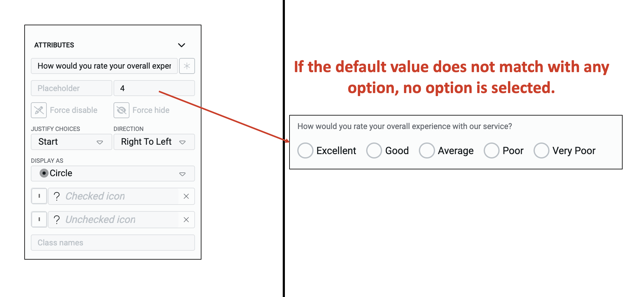
c. Default value - The text typed in this field becomes the default value for the element. If the user selects a different value to the element, then the default value will be replaced by the user selected value. If the user does not interact with the element, then the default value will be submitted as element value.
A default value may be useful when you feel most users will select the same value, however, you still want to give them a flexibility to change the value of the element. For example - you may want to keep the default value of satisfaction from service as Excellent. If the user does not agree with this option, one has the flexibility to change the same.
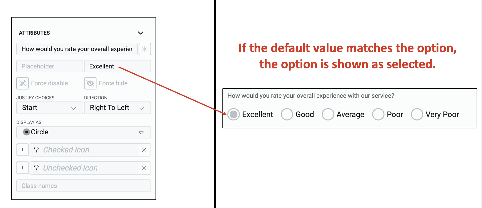
The default value that you type in the field will be effective only if it matches with one of the defined choices for the element.
In case, the typed value does not match any of the defined choice values, then the default value will be taken as NULL.
d. Force disable - If this field is clicked ON, then it will supersede all enable conditions and the element will always remain in disabled mode.
e. Force hide - If this field is clicked ON, then it will supersede all show conditions and the element will always remain hidden from the user.
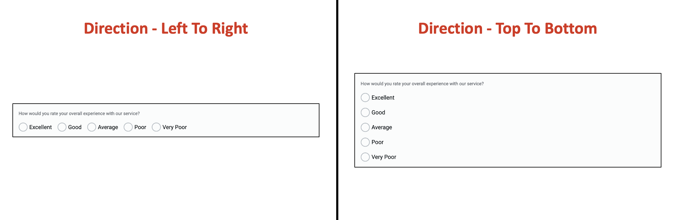
f. Justify choices - The value in this field will justify the options along the line of the axis of the direction (discussed next). Therefore, if the direction is selected as Top to Bottom (vertical), the justify will arrange options top-down, while if direction is selected Right to Left (horizontal), the justify will arrange options left-right.
The below image shows various arrangements for Right to Left direction.
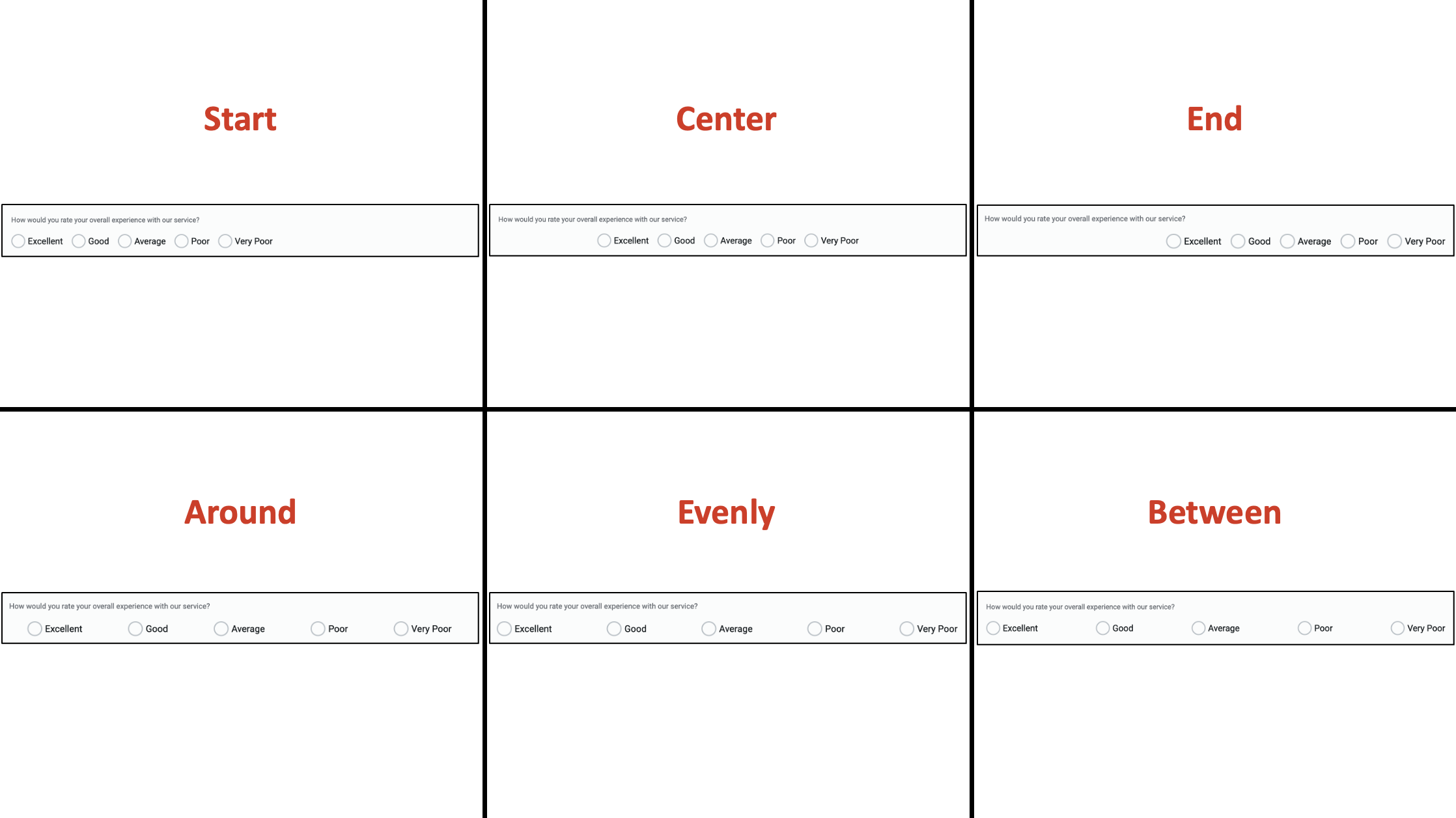
You can learn more about justify and align in this article on Root Section.
g. Direction - This field defines the axis along which the options will be displayed. This field as two options:
- Right to Left - arranges options in horizontal direction
- Top to Bottom - arranges options in vertical direction
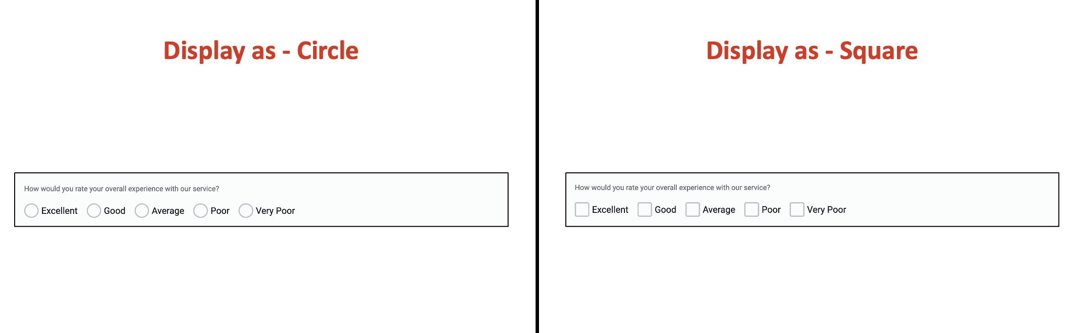
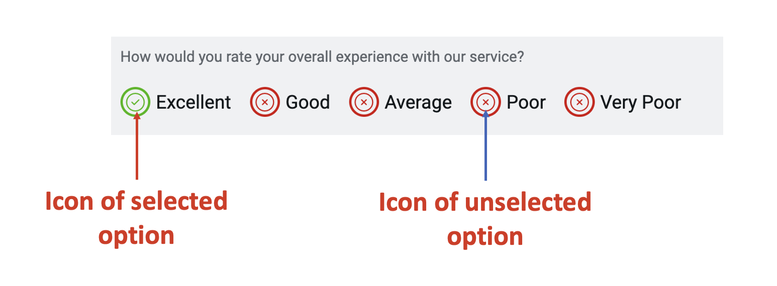
h. Display as (type of checkbox) - This field defines how the checkbox will appear to the user. This checkbox appears before the option and indicates whether the option has been selected or not.
There are two options:
- Square
- Circle
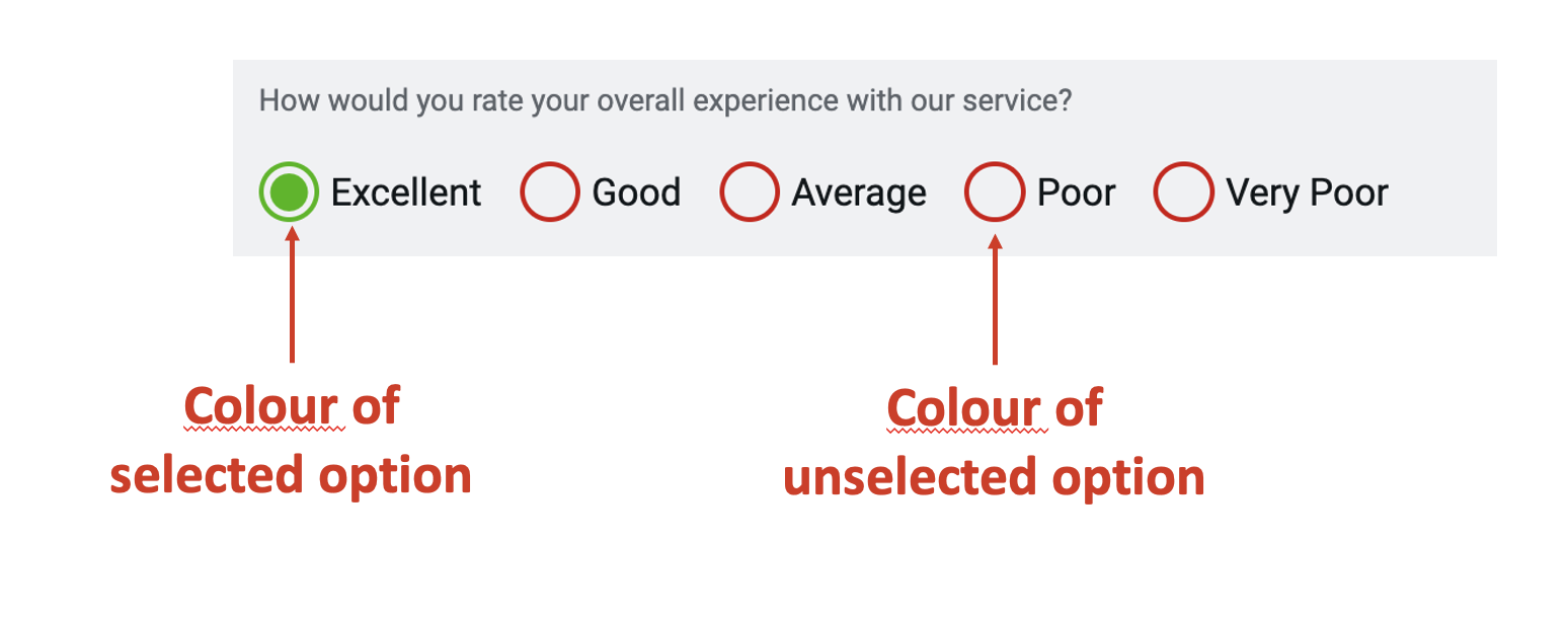
i. Colour of checkbox - You can select the colour of the checkbox appearance. Colour can be set using the colour setting panel.
To open colour setting panel, click on the field.
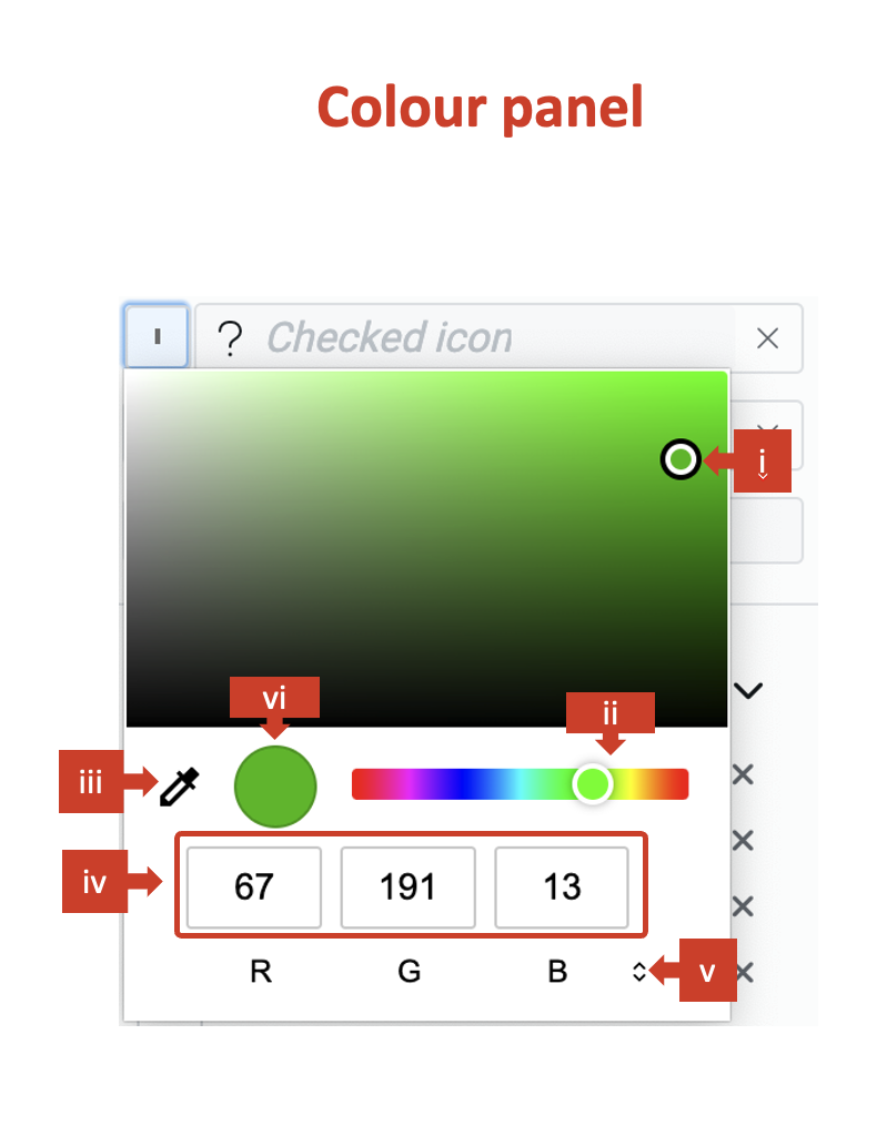
You will receive the following options to set colour for the option.
i. Drag the point on the color shade. ii. Drag the point to change the colour over the spectrum. iii. Click on the dropper to copy colour settings from other image point visible on the screen. iv. Set code for colour definition method (for example - set code for R, G and B). v. Change the colour definition method. There are three options available - RGB, HSL and Hex.
vi. The defined colour is visible in the circle.
You can set the colour of the checkbox for both checked and unchecked options.
j. Icon to appear within checkbox - You can select the icon that will appear within the checkbox to indicate selected / unselected options.
To set the option icon consider the following steps:
- Click on this field.
- The icon picker will open. The icon picker has a list of 1389 icons.
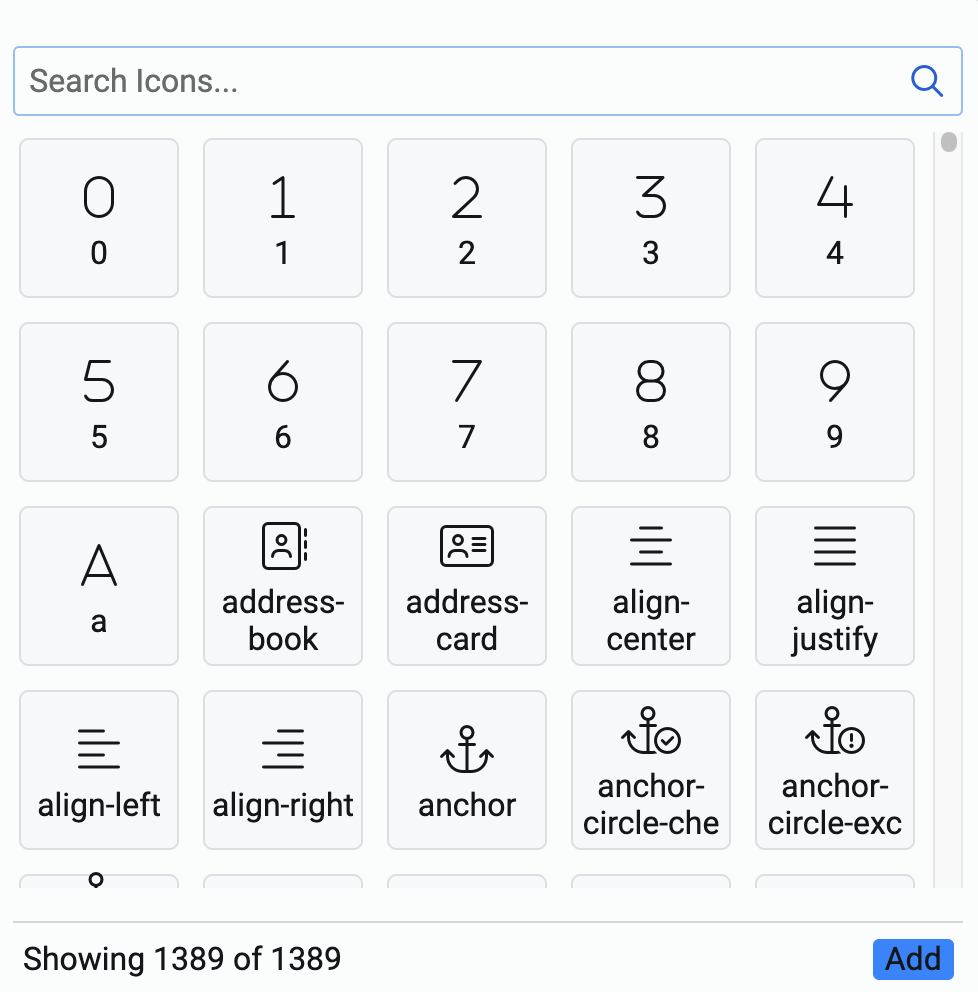
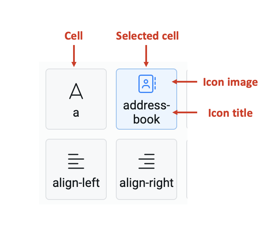
Each cell represents an icon with the icon image displayed on top and its title display below it.
-
You can search for the icon from the search icons bar. The system matches the typed keyword with the icon title and displays all the icon cells that match.
-
Select an icon by clicking on the cell. The selected cell is highlighted in blue. Please note, you can select one and only one cell.
-
Click Add at the bottom right corner of the icon picker.
You can set the icons for both checked (selected) and unchecked (unselected) options.
k. Class names - In this field, you can type the name of the CSS class and the element will be styled as per the CSS class definition.
Choices category
This category houses all the options which the choice element will display to a user.
When creating the options for the first time for the element, the category will appear as shown below:
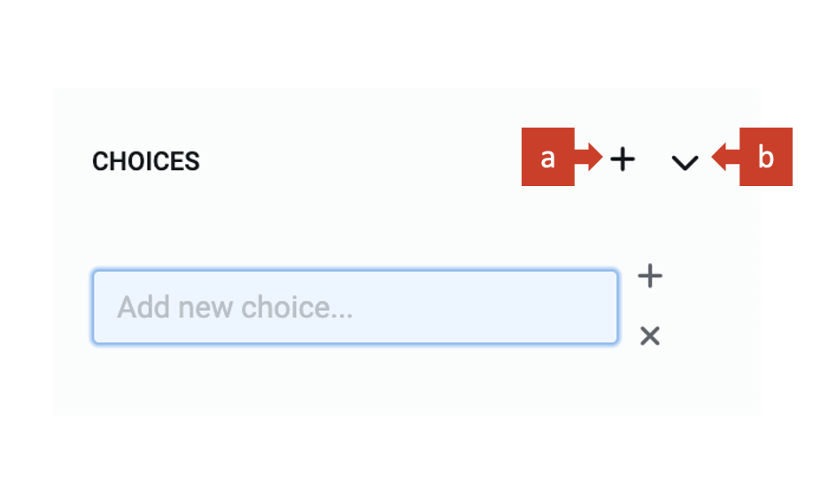
It has two buttons:
a. "+" - Clicking on this open the field to define a new option for the choice element.
b. ">" - This button toggles the open/collapse choices category.
Adding new choices
To add new choices to the element, consider the following steps:
-
Click on "+". The "Add new choice" field will appear.
-
Type the text for the option title.
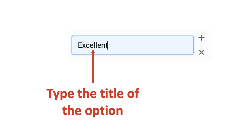
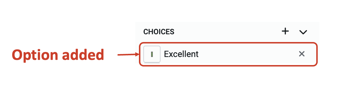
- Press enter. The entered text will now become an option.
Updating existing options
You can perform the following update actions on the option:
a. Update the option text
Double click on the option text and it will become editable.
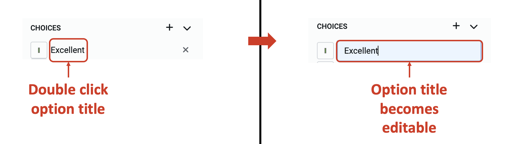
Update the text and press enter. The option text will be updated.
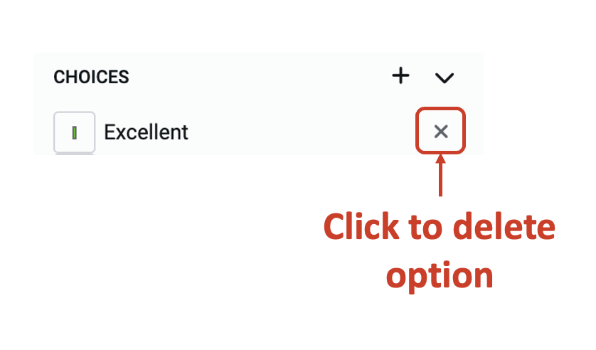
b. Delete an option
Click on the X icon and the option will be deleted from the list.
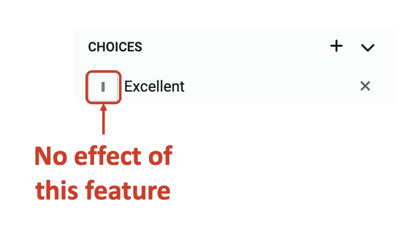
The colour of the option in the choices category does not take effect.